


In the world of art and design, understanding color relationships can dramatically elevate your work. You may have wondered, what is a tertiary color, and how can it affect your artwork? By exploring analogous color scheme examples, artists can unlock new dimensions of creativity. From painting to digital design, grasping analogous color harmony can transform your projects into cohesive and striking masterpieces.
Learning to use analogous colors in painting is essential for artists seeking harmony in their visual compositions. This approach not only enriches your palette but also infuses your work with a sense of unity and depth. Let’s delve deeper into these fascinating concepts that can redefine your artistic journey.
Understanding What Is a Tertiary Color
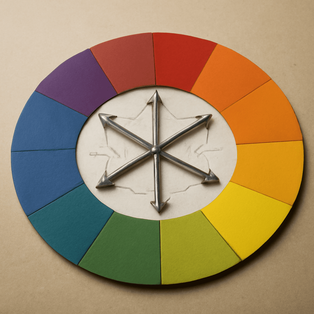
Tertiary colors are the result of mixing a primary color with a secondary color. These hues can be seen as the bridge between primary and secondary colors, offering a vast spectrum of shades. When you know what is a tertiary color, you can utilize these in crafting more nuanced designs.
For example, mixing blue (primary) with green (secondary) creates blue-green, a tertiary hue. These colors are not just transitional; they are vital for creating depth and realism in your artwork. Recognizing these blends allows you to experiment with color dynamics, enhancing your overall design.
Exploring Analogous Color Scheme Examples
Analogous color schemes involve using colors that are next to each other on the color wheel. This method builds visual unity and can evoke specific moods in your work. Let’s look at some analogous color scheme examples that you might find inspiring.
Consider a palette with green, blue-green, and blue. This trio creates a serene and calming effect, ideal for landscapes or serene digital artwork. The proximity of these colors provides a naturally pleasing effect, making it easier to achieve a harmonious look.
Using variations of red, red-orange, and orange can evoke warmth and energy. These combinations are perfect for vibrant designs or dynamic compositions that require an inviting feel. Experimenting with these examples helps you understand the power of harmonious color blending.
The Beauty of Analogous Color Harmony in Design
Exploring the analogous color harmony offers designers the ability to craft visually connected yet diverse designs. This harmony arises from the subtle shifts between the hues, creating a seamless transition that is soothing to the eye.
Different spaces call for different moods. In graphic design, analogous harmony can guide the viewer’s eye fluidly across a page, enhancing readability and aesthetic appeal. In interior design, it can create a cohesive atmosphere that feels intentional and balanced.
The use of this harmony in branding ensures a unified look across various marketing materials. By embedding analogous harmony, your designs will not only stand out but also resonate more deeply with your audience, embodying professionalism and creativity.
Using Analogous Colors in Painting
When it comes to analogous colors in painting, artists can create visually compelling pieces that convey depth and emotion. By selecting colors that naturally complement each other, you achieve a more integrated and flowing composition.
Imagine painting a sunset with yellows, oranges, and reds. These colors blend effortlessly, reflecting the natural beauty of dusk. In portraiture, using analogous hues can add warmth or coolness to skin tones, enhancing the subject’s lifelike quality.
Experimenting with layering these colors can also add texture and vibrancy. By using glazing techniques or wet-on-wet applications, you allow the colors to mix directly on the canvas, creating unique and appealing effects that draw the viewer in.
Tips for Incorporating Tertiary and Analogous Colors
Integrating tertiary and analogous colors into your work doesn’t have to be daunting. Start by selecting a base color and then identify the related tertiary and analogous hues. This method ensures that your palette remains cohesive.
- Balance: Avoid overwhelming the composition with too many colors. Stick to a few analogous hues to maintain harmony.
- Contrast: Introduce a contrasting color sparingly to highlight focal points without disrupting the overall unity.
- Experimentation: Don’t be afraid to test new combinations and observe how they interact on the canvas or screen.
Understanding what is a tertiary color and how to harness analogous schemes can profoundly impact your design process. By applying these principles, your art will not only captivate but also consistently communicate your intended message. Embrace the power of color, and watch your creativity flourish.