


A focused design brief can turn a collection of attractive references into a logo that fits a specific organization. Looking for inspiration for a logo means studying how a mark solves a visual problem: what reads first, how the shapes relate, and what remains clear at a small size. Strong logo design examples give you evidence to examine before you begin sketching.
Use the examples below as studies in form and hierarchy. Record the principle you notice, then translate it into a requirement for your own project. The goal is a useful direction that grows from the new brand’s name, audience, and setting.
Great Logo Designs: Look at Form First
Start by covering the colors in your mind and looking at the structure. Is the mark a word, a symbol, or a combination? Does it occupy a compact square, a wide rectangle, or an irregular silhouette? A compact mark may fit an app icon or profile image; a long wordmark may work well on a sign but need a smaller companion for tight spaces.
Examine the negative space inside and around the letters. Small gaps can close when a logo shrinks, while too much distance can make related elements appear disconnected. Look at the mark in context as well as in isolation. A strong shape must share space with headlines, pictures, and navigation without losing its role.
When gathering logo inspiration, note the visual task beside each reference. Write “a short name can also serve as a layout device,” for example, instead of “make it look like this.” That distinction gives you something useful to test without importing another brand’s identity.
Three real examples to study
NASA: a wordmark and an emblem solve different tasks
NASA’s history of its symbols shows both the round insignia and the stylized “worm” logotype. The insignia layers a blue circular field, stars, a red wing, an orbit, and the agency name. The name occupies the center, while the orbit and wing add movement around and through it. Those overlapping elements make a rich emblem, but they also create fine detail to consider at small sizes.
The worm uses a continuous-looking letter treatment and a much simpler silhouette. Compare how the two identify the same organization through different amounts of information. For your brief, the lesson could be to test both a detailed ceremonial version and a simpler identifier for small digital spaces. NASA’s brand guidelines restrict use of its identifiers; study them as references rather than placing them in a new brand.
Minneapolis Institute of Art: proportions create flexibility
Pentagram’s Minneapolis Institute of Art case study explains that the width of the “M” equals the combined width of the “i” and “a.” That relationship lets the mark form a balanced horizontal or stacked arrangement. The short name is large and immediate; the full institutional name can accompany it when more context is needed.
Look at the examples with the mark over artwork and beside supporting text. The design is not merely a standalone shape: its proportions help it occupy a corner, frame an image, or form a pattern. A brief inspired by this principle might ask for a compact mark and a full-name lockup that share a common grid.
MIT Museum: an intersection becomes a system
In Pentagram’s MIT Museum identity, the two M forms meet at a right angle. The designers use the mark as a frame and reconfigure it across applications. Follow the edge where the letters meet, then see how the same geometry relates to images and typography in the case study.
The useful observation is the role of a clear structural rule. A new design might use an alignment, shared edge, or modular unit drawn from its own name. It need not repeat the M shape or the right-angle arrangement. The rule should help organize real content, not just produce a clever isolated mark.
Compare spacing and hierarchy
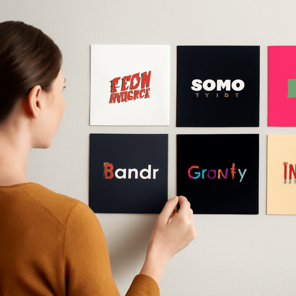
Put references at similar visible sizes on a page. Identify the first element your eye finds, then the second. In an emblem, it may be the name inside a boundary. In a wordmark with a descriptor, the name may carry the greatest weight while smaller text explains the organization. Ask which information must remain legible when the mark is reduced.
Measure spacing by relationships rather than fixed numbers. Compare the gap between a symbol and its name with the space around the whole lockup. Then check letter spacing: a mechanically equal gap can look uneven next to different letter shapes. Adjust by eye and test at both large and small sizes.
Top logo designs can teach different solutions to the same constraint. Great logo designs also account for the places where people encounter them. One relies on a compact symbol, another on the rhythm of its letters. Compare them against the actual placement: a small browser tab, a storefront, a package, or a presentation slide. A successful choice for one location may need a companion version for another.
Turn observations into a brief
Collect three to five logo inspirations and write a sentence about the function of each. Then close the reference images and describe the new project in its own terms. Include the name, audience, personality, required applications, and practical constraints. If a nonprofit needs to be recognized on event badges and large banners, say so; those sizes affect the design.
Convert observations into testable instructions. Instead of “make it modern,” specify “create a readable wordmark with a compact version for a 32-pixel icon.” Instead of asking for a famous logo’s shape, ask for “a modular relationship between the name and a supporting symbol.” The latter leaves room for a distinctive solution.
Sketch several directions from the brief. Compare each in one color, at thumbnail size, and alongside a realistic headline or photograph. Ask someone unfamiliar with the project what they read first. Use the answer to adjust hierarchy and spacing, then check the selected design for possible conflicts with existing marks before adoption.
Inspirational logos are starting points for observation. Now open one linked case study, write down one structural principle, and turn it into a single measurable requirement for your own brief.