

How to Curve Text: Mastering Text Effects with Ease
In today’s digital landscape, the ability to make text curve can significantly enhance your design projects, transforming ordinary typography into captivating visual elements. Whether you’re designing logos, posters, or social media graphics, knowing how to make text curve adds a dynamic, professional touch to your work. This guide will introduce you to simple methods for creating arc text, ensuring you can master the art of curved text with ease.
With the right tools and techniques, you can effortlessly arch text, creating stunning designs that captivate and inform. From understanding the basics to exploring advanced techniques, you’ll find everything you need to learn how to make curved text that stands out. Let’s dive into the essentials of curving text and explore the creative possibilities it offers.
Understanding the Basics of Curved Text
What is Curved Text?
Curved text refers to text that follows a non-linear path, often appearing in an arc, circle, or wave pattern. This technique is widely used in graphic design to add movement and interest to typography. By curving text, you can break away from traditional horizontal layouts and introduce a sense of flow and dynamism.
Why Use Curved Text in Your Designs?
Curved text is not only visually appealing but also functional. It allows you to focus attention on specific areas of your design, guiding the viewer’s eye and enhancing engagement. In branding, curved text can make logos and headlines more memorable, adding an artistic flair that distinguishes your design from others. Additionally, it can be used to complement circular images or elements, creating harmony in your layout.
Tools You Need to Arch Text
Software Options for Text Curving
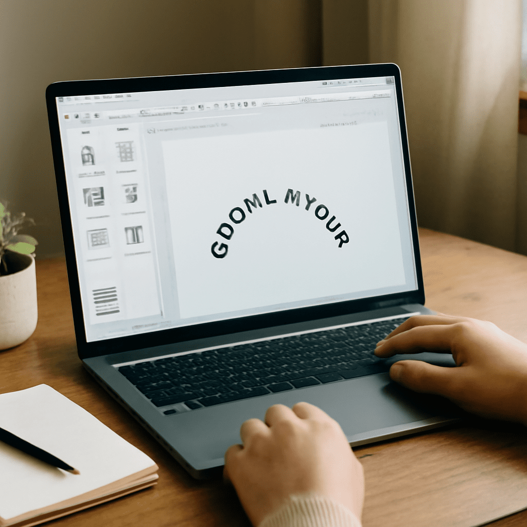
Several software options allow you to arch text, ranging from professional graphic design tools to user-friendly apps. Adobe Illustrator and Photoshop are popular choices for their robust text manipulation features. These programs offer predefined text paths and the ability to manually adjust curves. For simpler tasks, Canva and Figma provide intuitive interfaces for creating curved text quickly without needing extensive design experience.
Free vs. Paid Tools
When deciding between free and paid tools for text curving, consider your design needs and budget. Free tools like GIMP and Inkscape offer basic curving functionalities suitable for casual projects. They are excellent for beginners who want to learn how to make text curve without financial commitment. On the other hand, paid tools like Adobe Creative Suite offer advanced features and more precise control, ideal for professional designers seeking high-quality results.
How to Make Text Curve: Step-by-Step Guide
Preparing Your Text
Before you start curving your text, ensure your text is well-prepared. Choose a font that complements the curved layout—sans-serif fonts often work best for readability in curved formats. Type your text in a plain layout first, ensuring that all spellings and sizes are consistent, as adjusting these later can disrupt your design.
Using Built-in Software Features
Most design software includes built-in features for curving text. In Adobe Illustrator, select your text and use the “Type on a Path” tool to start curving. Adjust the path and align the text according to your design needs. Photoshop users can click on the “Warp Text” feature, choosing an arc or wave preset to apply the curve. Explore different settings to see how the curve impacts the overall aesthetic of your text.
Manual Techniques for Curving Text
If you prefer manual control, you can curve text by adjusting individual letters. This approach is time-consuming but offers unparalleled customization. Use anchor points in vector-based software to rotate and position each letter along your desired curve. This technique allows for intricate designs with personalized touch but requires patience and precision.
Tips for Perfectly Arched Text
Choosing the Right Font
The font choice is crucial when curving text. Opt for fonts that maintain legibility even when distorted. Avoid overly elaborate fonts that may become unreadable when curved. Experiment with different font sizes and styles to achieve the best visual impact while ensuring the text remains clear.
Adjusting the Curve for Readability
Readability is key in curved text designs. Adjust the curve’s degree to ensure letters do not overlap or become too compressed. Aim for a balanced curve that enhances the text without compromising clarity. Monitor the spacing between letters and tweak the path as needed to maintain smooth flow and readability.
Common Mistakes to Avoid
When learning to make text curve, avoid common pitfalls such as excessive distortion or cluttered designs. Overly steep curves can make text illegible, while minimal curves may not produce the desired effect. Ensure that the curve complements the overall design and does not detract from the message you want to convey.
Exploring Advanced Arc Text Techniques
Combining Curved Text with Images
Integrating curved text with images can create visually striking designs. Position text around circular images or within complex compositions to enhance harmony. Use masking techniques to blend text seamlessly with visual elements, ensuring cohesive designs that capture attention.
Creating 3D Curved Text Effects
For a more dramatic impact, explore 3D curved text effects. Software like Blender and After Effects can elevate your designs, adding depth and dimension to curved text. Experiment with lighting and shading to achieve realistic three-dimensional effects that stand out in both print and digital formats.