

A clear card lets someone find your name, what you do and how to reach you at a glance. A restrained business-card design achieves that by giving each detail a deliberate place and leaving enough empty space around it.
Start with one useful contact method and a short role, then choose a business card arrangement that makes the name the first thing a reader sees. The result can feel distinctive without making the information compete with decoration.
Business Cards Layout Choices for a Clear First Impression
For business cards, layout begins with the reading order. Put the name first, the role second and the contact details third. Group related information rather than scattering it into separate corners. The recipient can then find the next step quickly.
Before opening a design program, write down the exact text: name, role, email and, if useful, a phone number or website. Choose the details a recipient will actually use. A photographer might prioritize a portfolio address; a consultant might choose a phone number and email. An address or social handle can be omitted when it has no clear purpose.
When comparing designs for business cards, look at where each line starts. A common left edge makes a short list easy to scan. Centered text can feel balanced, but long email addresses and short names create uneven shapes, so check the whole block rather than centering every element automatically.
Three arrangements with a purpose
One aligned column. Place the name near the upper left of the safe area, the role directly below it and the contact lines farther down. Keep the lines aligned. This arrangement suits a card with several practical details because the eye has a predictable path. Leave a noticeable gap between identity and contact information so the two groups do not become one dense paragraph.
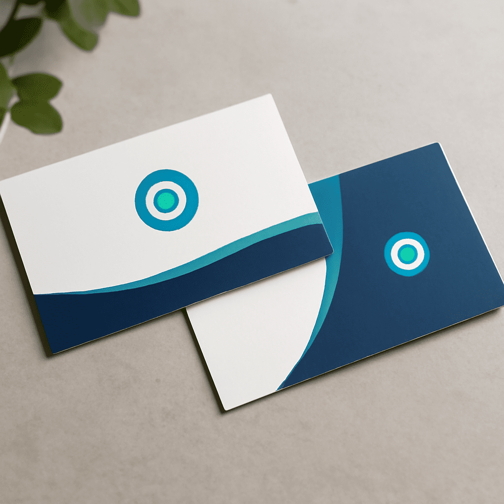
Two-sided identity. Put a small logo or name on one side and the complete name, role and contact details on the other. This gives a mark room to breathe while keeping the information side functional. The contact side must stand on its own.
Name and narrow contact block. Set the name and role on the left, then align a compact contact block to their right. This can work well for just an email and a short website. If a long address forces either column into tiny type, return to the single column. Empty space is a working part of the layout, not an area that must be filled.
The appeal of simple business card designs is that the relationship between elements stays visible. Choose a business card layout first, then adjust its spacing.
Build a small type hierarchy
Use one type family with two weights to begin. Set the name in a stronger weight or a slightly larger size, the role in regular type and contact lines at a consistent smaller size. Avoid making every line bold: when everything has equal emphasis, the reader loses the visual route through the card.
Use the actual longest email address when testing. Increase the text size until the details are comfortable to read, then remove unnecessary content before shrinking it again. MOO’s design guidelines specify at least 8-point type for its cards; treating that minimum as a floor rather than a target leaves room for a more comfortable result.
High contrast helps: dark text on a light background is a practical starting point. A single accent color can mark the role or a small rule, but it should not carry information that disappears when contrast is weak. Avoid putting small text over a busy photograph. Print a test at actual size and read it under ordinary indoor light rather than judging only a magnified screen preview.
Turn the idea into a usable brief
The following is an example for a fictional designer. The email and domain are placeholders; replace them with verified details before printing. On a horizontal card, keep the four lines in a left-aligned block, with a larger gap before the contact details:
Avery Morgan
Illustrator
[email protected]
example.com
For the front, use dark charcoal type on warm white stock. Make the name semibold, keep the other lines regular and use one muted blue accent for a short rule beside the role. Put no full-bleed artwork on this side. On the back, place a small one-color monogram in the center, leaving the rest of the surface blank. This gives a designer or print service specific decisions to implement without prescribing a particular application.
The same brief can serve personal business card designs by changing the role to a field of interest and using a personal email. For a calling card design intended for social introductions, a name and preferred contact method may be enough; a job title is optional. Visiting card designs used for appointments can instead reserve the back for a handwritten date and time, provided the chosen surface accepts pen.
For professional business card designs shared at conferences, consider the recipient’s next action. If it is to view work, use a short portfolio address that can be typed easily. A QR code can supplement that address if it is large enough to scan in a physical proof, but should not replace the readable contact details. Test the code with more than one phone before approving the print file.
Prepare the file for an actual printer
A plain business card becomes much easier to print when the canvas matches the printer’s template. Three boundaries matter: trim is the intended cut; the safe area is the region for important text and logos; and bleed is extra background beyond the cut that prevents an unintended white sliver if cutting shifts slightly.
For example, MOO’s U.S. standard-card template uses a 3.66 by 2.16 inch bleed area, a 3.50 by 2.00 inch trim size and a 3.34 by 1.84 inch safe area. Extend a colored background to the outside of the bleed, but keep the name, contacts and monogram inside the safe area. These dimensions belong to that product; use the selected printer’s own template for a different size or service.
MOO recommends vector PDF artwork, photographs at 300 dpi or higher and no added crop marks for its process. Other printers may ask for different file settings. Export each side as requested, inspect the proof for missing letters or shifted elements, and verify the spelling of every contact detail. A physical proof also reveals type and paper at actual size.
Open your chosen printer’s template now and set the fictional example above with your own name and contact details. Print it at final size, circle anything hard to read, and revise the spacing before ordering a batch.