

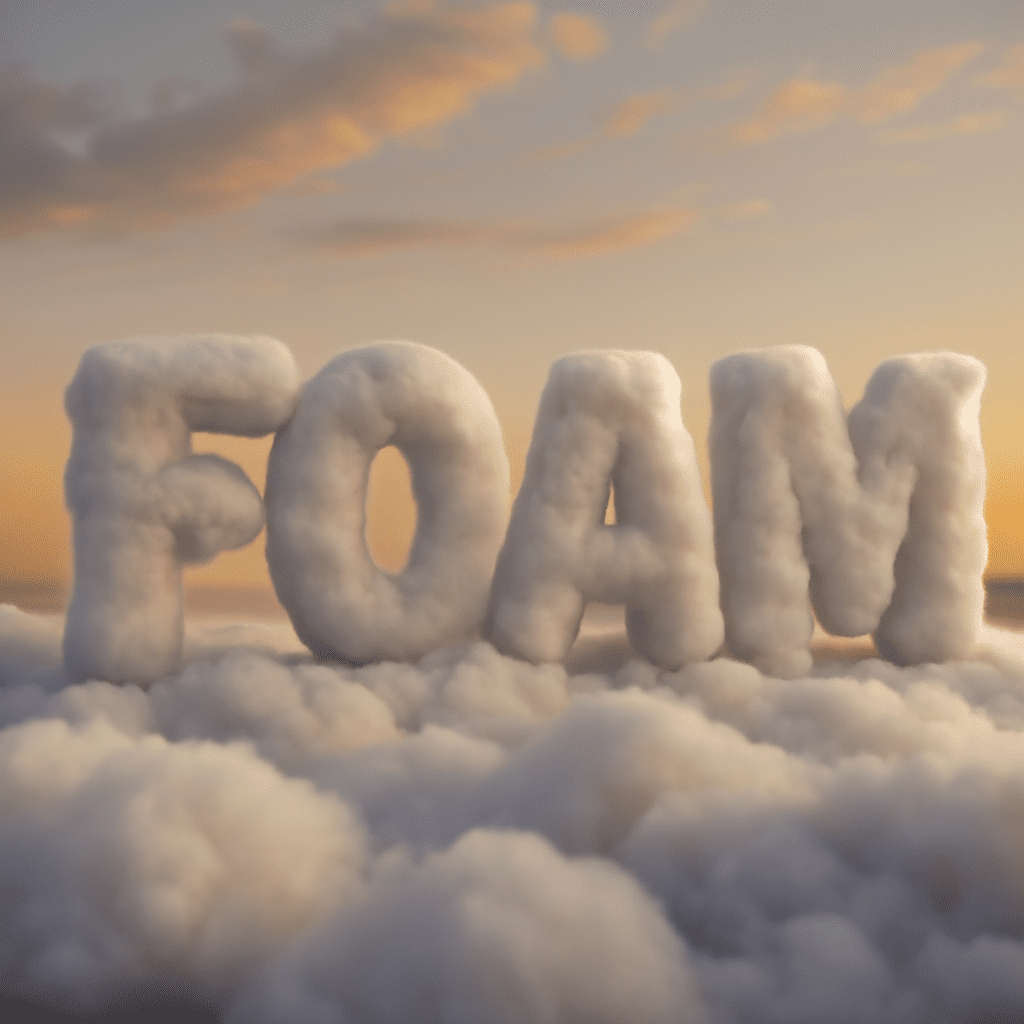
A dimensional headline can give a poster or social graphic a sense of depth before you add any illustration. Free fonts with a three-dimensional look make that effect available directly in the lettering. Compare how the letterforms create depth, then preview your own words at their final size before choosing one.
3D Letter Font Options to Try
These display faces offer different ways to suggest dimension. Each free dimensional typeface is available from Google Fonts under the SIL Open Font License, version 1.1. Follow the linked specimen pages to preview and download them, and read the license included with the file.
- Bungee Shade combines bold, sign-inspired letterforms with an offset shaded treatment. Its substantial shapes can make a short headline feel like a painted sign. Give the letters enough room to keep the depth and face distinct.
- Londrina Shadow has a looser, hand-drawn character and an outlined shadow effect. It is a good candidate for a playful poster or informal title. Its open details need a clear background and a generous display size.
- Rubik Iso uses an angular, isometric line treatment that gives the characters a constructed appearance. Try it for a geometric or technology-themed graphic, then check complex letters at a smaller size because the internal lines carry much of the effect.
These free 3D fonts are display choices: use them for a short phrase, then pair them with a simpler face for instructions or body text. The result is easier to scan and gives the dimensional treatment a clear role in the composition.
Decide what kind of depth you need
An offset shadow places a second shape behind the face of a letter. A hatched or outlined side suggests a surface extending away from it. An isometric design uses angled lines and geometry to imply a solid form. Each approach can look dimensional on a flat image, but each makes different demands on space and contrast.
When choosing a font, 3D depth should support the message. A heavy shadow can give a short sale announcement energy, while a finer outline might suit an invitation or playful label. If your background already contains strong lines and textures, a solid letter face with simpler depth can be easier to distinguish.
Check whether the depth is built into the glyphs or made as an editable effect in your design application. Built-in shading is quick and consistent, but its direction and details may be difficult to change independently. A plain bold face with a separate offset or extrusion effect gives you more control over color and depth, although it takes additional setup.
Preview your actual words
Type the exact headline, including numbers, punctuation, and any accented characters. Do not rely only on a specimen alphabet. The shape of your phrase matters: repeated narrow letters may create a different rhythm from wide letters such as M and W. Confirm that every required character is present and looks consistent with the rest.
Make three versions at the intended size, one in each no-cost dimensional typeface. Place them in the real layout rather than on an empty white page. If the piece will appear as a small social preview, reduce it to that viewing size. If it will be printed, make a proof at the intended physical dimensions. A 3D letter font that looks striking on a large screen can lose the inner spaces of its letters on a small label.
Look first at the letter faces. Can you read the words without studying the shadows? Then inspect the depth: do adjacent shadows collide, or do fine internal lines merge? Increase the size, simplify the text, or choose a less detailed face when the effect makes the message harder to recognize.
Adjust contrast and spacing
Use enough contrast between the lettering and the surface behind it. On a photograph, place the headline over a quieter area, add a restrained overlay, or use a solid panel. On a colored background, compare a light and a dark treatment. Fine outlines need particular care because they occupy less space than solid strokes.
Allow room around the lettering. A shadow may extend beyond the visible face of a character and make spacing feel tighter than the text box suggests. Adjust tracking gently, and check individual pairs if your software supports it. Too much spacing can break a word apart; too little can make the dimensional sides overlap.
Keep the direction of shadows consistent with other dimensional elements in the design. If an illustration has light from the upper left, a headline with a conflicting heavy shadow can feel disconnected. You can also deliberately use a flat background to give the type the leading role.
Check format and use terms
A free 3D font is still font software with license conditions. The SIL Open Font License permits commercial use of these fonts, including in graphics, but redistribution of the font files has conditions. Those include retaining the license and copyright notice with redistributed copies; modified fonts must also respect any reserved font names and remain under the same license. The font files cannot be sold by themselves. Read the specific license supplied with each download before sharing or modifying the font.
Save the editable project and note the font name, source, and version. If you deliver artwork to someone who does not have the font, agree on whether to supply an appropriately licensed copy or provide an outlined or flattened version. Keep an editable text version for later corrections. Converting text to outlines preserves its appearance in many workflows but makes the words harder to edit as text.
Choose for the final application
For a bold sign-like headline, start with Bungee Shade. For a more informal outline, test Londrina Shadow; for geometric depth, try Rubik Iso. All three are available as 3D fonts free of a purchase fee, so compare them with the same words and background. Choose the design whose letter faces remain readable, whose dimensional details survive the final size, and whose license fits the way you will deliver the project.